Dambo — Brand development inspired by the company's rice-growing heritage
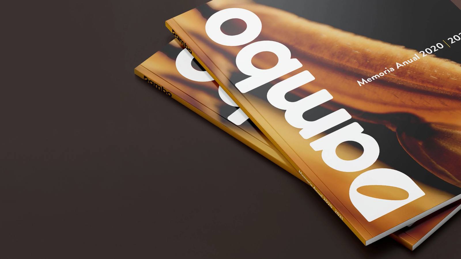
Challenge
Updating Dambo's identity to support its business evolution, synthesizing its agricultural roots, industrial consolidation, and growing international presence into a more compact, contemporary, and strategic brand system.
The challenge was to simplify the brand without losing its heritage, maintaining the link to rice as the core of the business while simultaneously conveying modernization, technology, and innovation. The new identity had to express sustained growth and position Dambo as a company that honors its essence while projecting the future.
Strategy
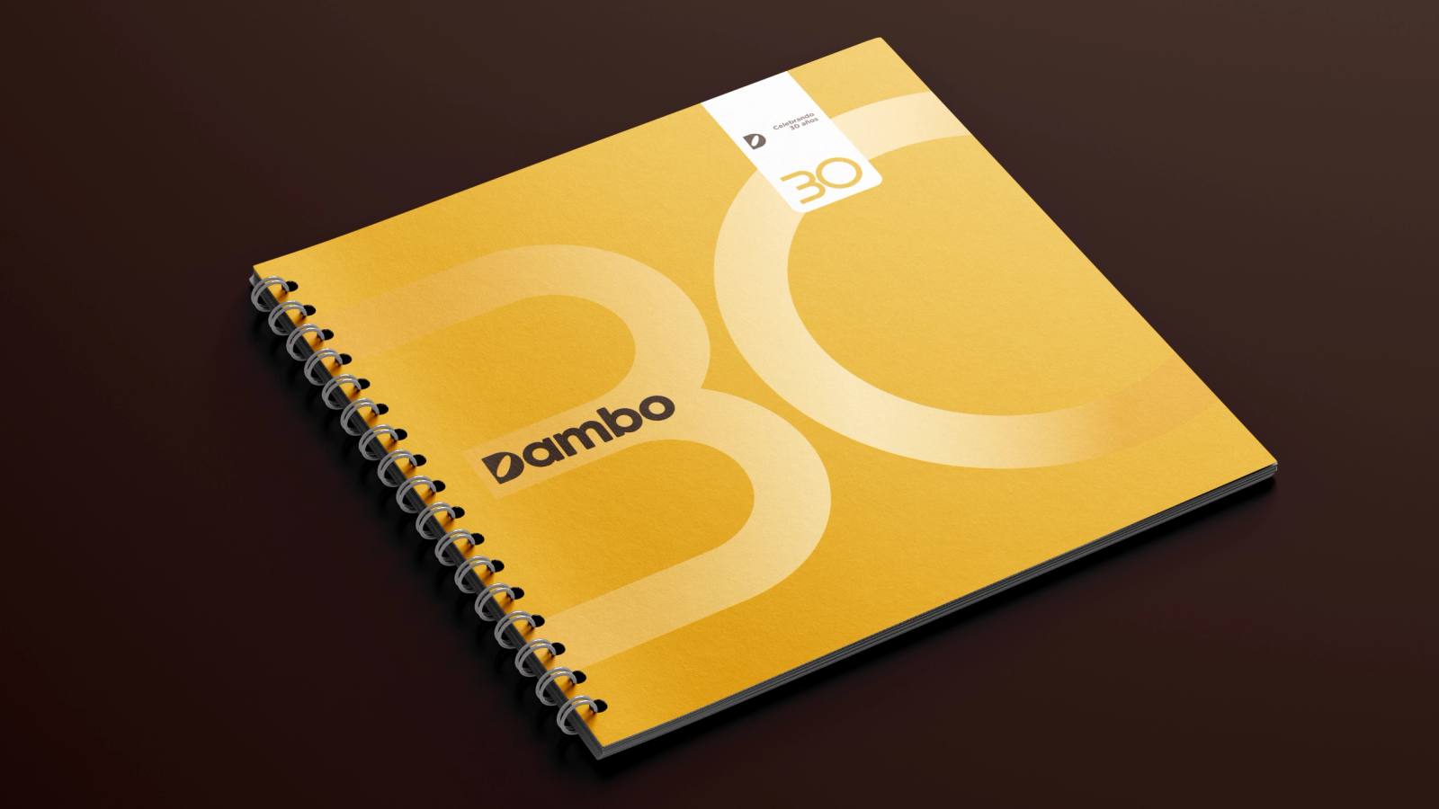
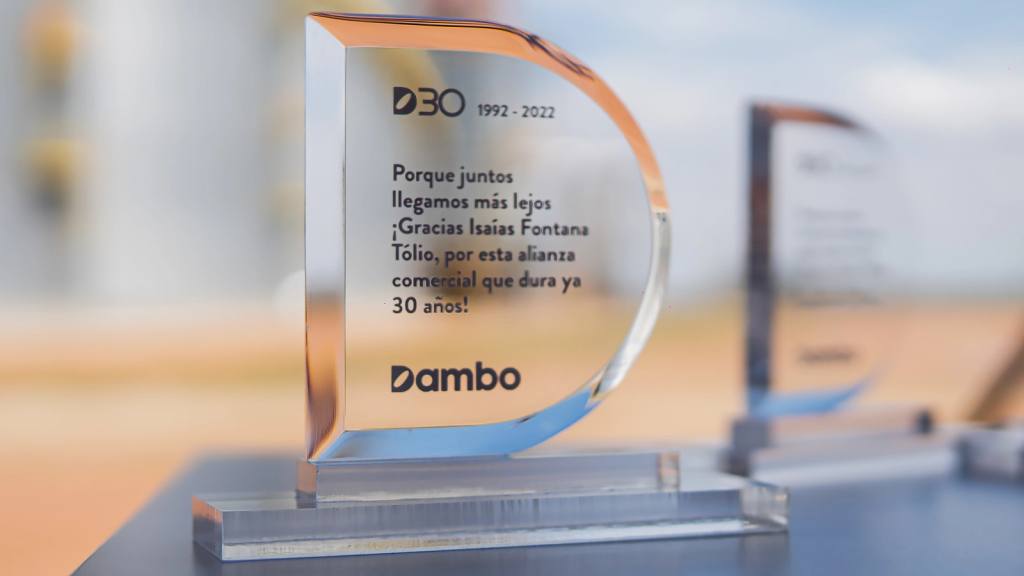
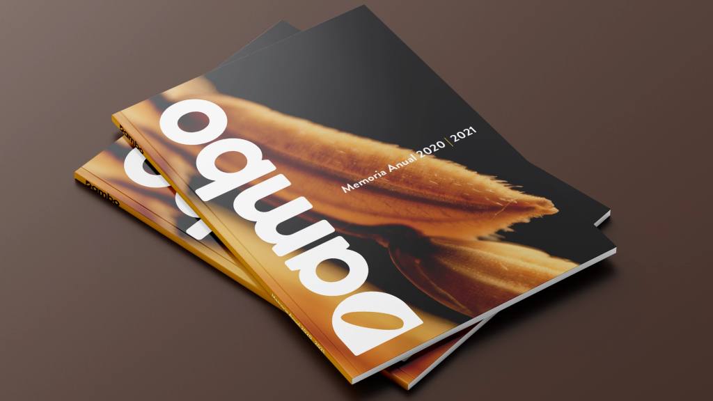
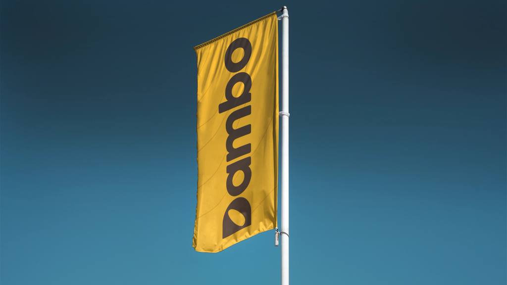
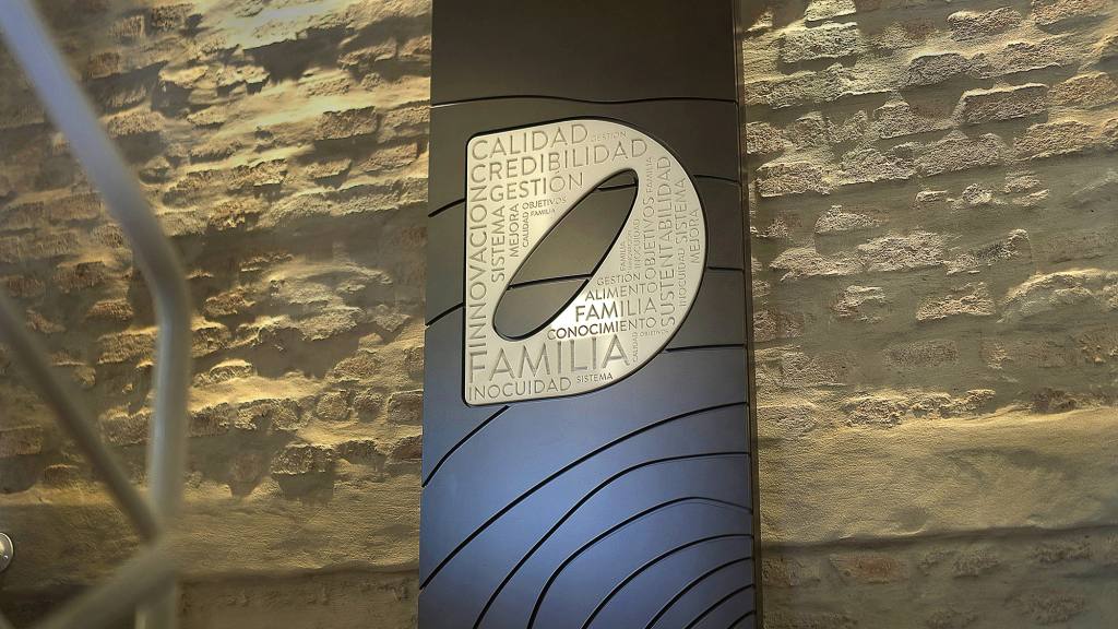
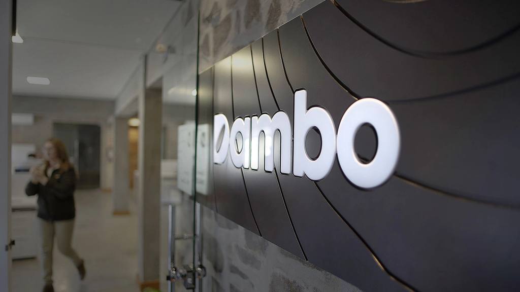
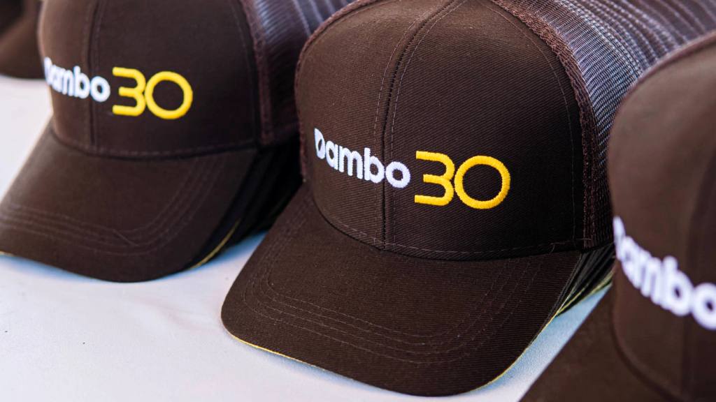
The visual strategy was built upon a geometric typeface, slightly modified to provide uniqueness and character. The key intervention centers on the letter “D,” where the counterform was replaced by the geometric silhouette of a rice grain, transforming the heart of the product into an identity symbol.
The upward slant of the grain introduces a narrative of projection and growth, representing the company's constant evolution and its expansion into new markets. This gesture converts a literal element into a visual metaphor for development and ambition.
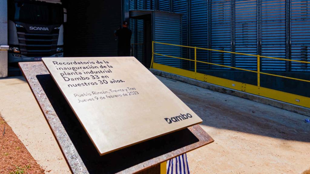
The color system was defined by a dark chromatic gray that evokes fertile soil and productive origins. In applicable formats, the metallic finish incorporates a technological and industrial dimension, reinforcing the modernization of processes and the professionalization achieved by the company.
The result is an identity balanced between field and industry, tradition and innovation, capable of synthesizing the essence, present, and future projection of Dambo into a compact mark.