Trial — National-Scale Private Label Brand Building
Challenge
Trial was a brand with over ten years in the market, present in more than 200 beauty, bath, and personal hygiene products sold exclusively at Ta-Ta locations nationwide. However, its identity did not match its reach or its strategic potential within the supermarket's private label ecosystem.
The main challenge was to transform a functional and undifferentiated brand into a modern, reliable, and coherent one, capable of competing visually on the shelf against established leaders like Gillette, Colgate, or Nivea, without losing its accessible price positioning.
Trial had to stop being perceived as a generic alternative and become a solid private label with its own identity. Additionally, it was necessary to develop a packaging system capable of spanning multiple categories and formats, managing the coexistence of over 200 products under a single visual language, and differentiating lines for men, women, and children without fragmenting the brand.
The challenge was not just to redesign. It was to build trust from the shelf.

Strategy
The strategy began by understanding that Trial should not compete through luxury or sophistication, but through clarity, functionality, and consistency. We worked on creating a modern and versatile identity, aligned with Ta-Ta's current stage and the evolution of its private labels, strengthening its role as a reliable and accessible brand for the Uruguayan family.
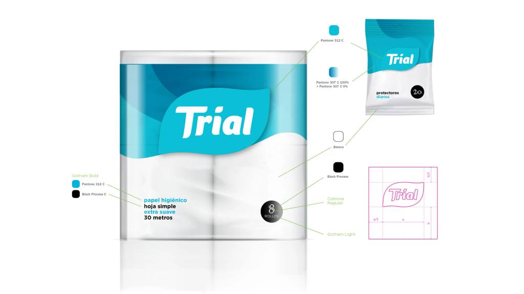
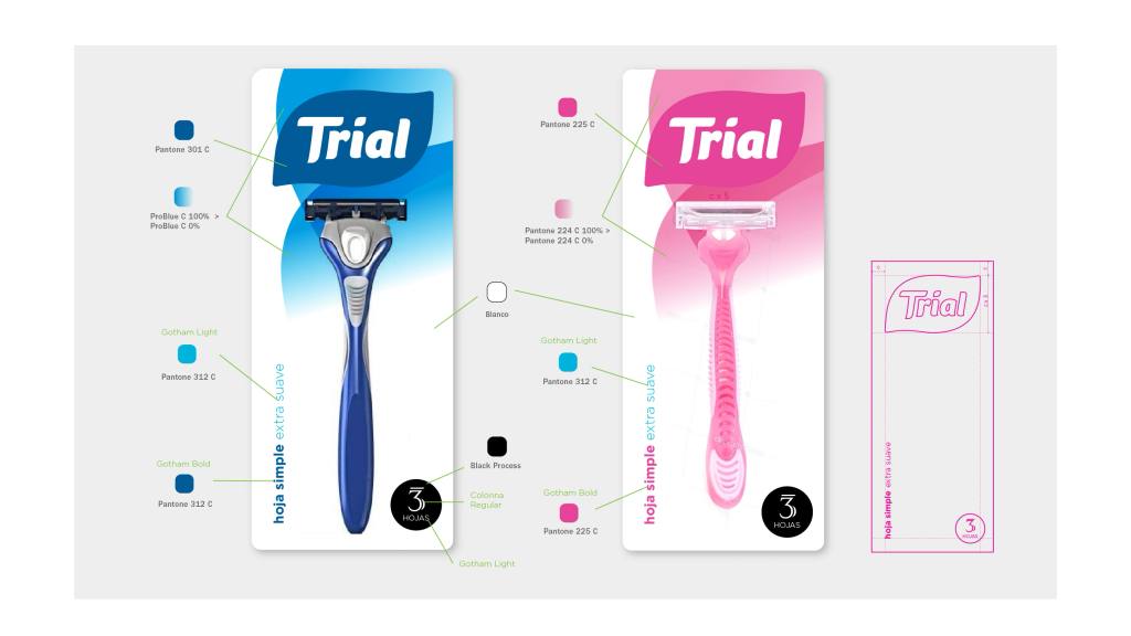
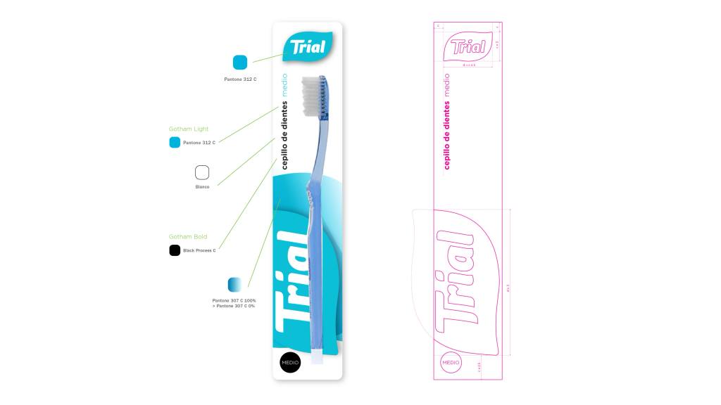
A unified brand system was developed to maintain a single strong and recognizable logo, while differences between lines were resolved through clear and aesthetic visual codes. The architecture had to be simple, easily identifiable on the shelf, and adaptable to multiple packaging types, from blisters to boxes or bags.
The packaging design was conceived as a system rather than isolated pieces. Grids, typographic hierarchies, consistent color usage, and graphic resources were defined to ensure cross-category coherence. Each product had to be recognizable as Trial from a distance, creating a brand block and increasing the perception of reliability.
The new identity sought to convey quality and modernity without artificially elevating the positioning. The message was clear: functional, durable, and reliable products at an accessible price with nationwide availability. Visual consistency allowed us to reverse the negative preconceptions associated with private labels and begin building value through design.
Thus, Trial evolved from a scattered line of products into a consolidated strategic private label within Ta-Ta, capable of competing on perception, not just on price.