Seinco — Precision Engineering with Water as the Protagonist
Challenge
Seinco is an engineering consultancy specializing in drinking water and sanitation. While their technical expertise and strategic role in infrastructure projects were solid, their visual identity did not clearly reflect this specialization or convey differentiation within the sector.
The challenge was to build a brand that expressed precision, technical knowledge, and a focus on water as the core of its activity. It was not about adding a literal symbol, but about synthesizing its essence into a simple, memorable, and conceptually coherent identity.
The brand had to communicate engineering, but also study, analysis, and a deep understanding of water behavior. It had to convey technical proficiency without losing clarity.
Strategy
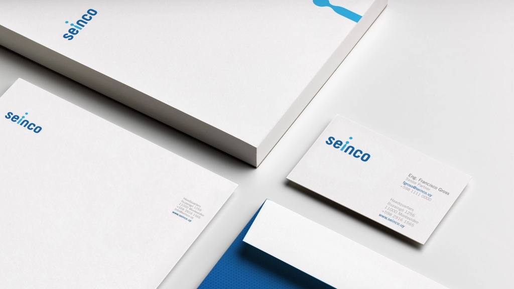
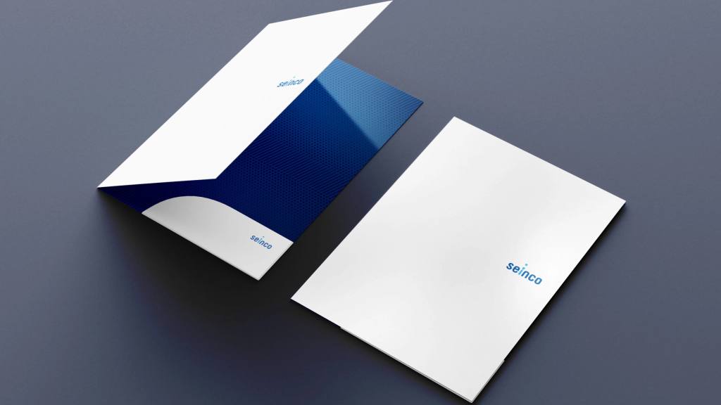
The strategy focused on making water the protagonist without resorting to obvious or decorative elements. The logo was developed as a system in itself, integrating the concept directly into its typographic structure.
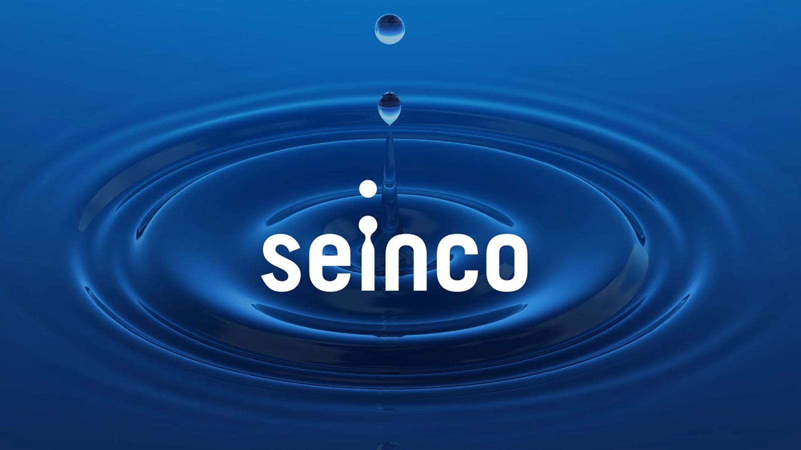
The droplet originates from the “I” in the name, projecting upward and integrating into the whole without the need for an independent symbol. This gesture achieves a synthetic and memorable identity, where the concept is not added, but built from the name itself.
The specific moment of the droplet is not accidental. It represents the study of water and its behavior, reflecting the precision engineering that defines Seinco's activity. It is not a static drop, but a moment of analysis, technical observation, and control.
Formal simplicity reinforces the idea of rigor and clarity. The brand does not require excess to communicate knowledge. From this synthesis, a professional, specialized identity is built, consistent with the technical level the consultancy offers.