Bantotal — Clear Direction toward the Core Banking
Challenge
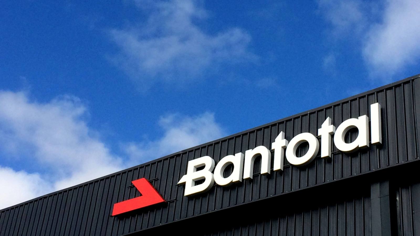
Bantotal needed to update its identity to align with its positioning as a core technological solution for financial institutions. Its brand had to reflect solidity, innovation, and leadership in a sector where trust and precision are fundamental.
The existing logo required a formal synthesis to make it more contemporary, powerful, and easily recognizable in increasingly demanding digital and corporate environments. The identity had to communicate progress, direction, and strategic vision, without losing the backing and heritage already built.
The challenge was to achieve a brand upgrade that simplified without weakening, modernized without breaking previous recognition, and projected Bantotal as a robust technology company, prepared to compete on a regional and international stage.
Strategy
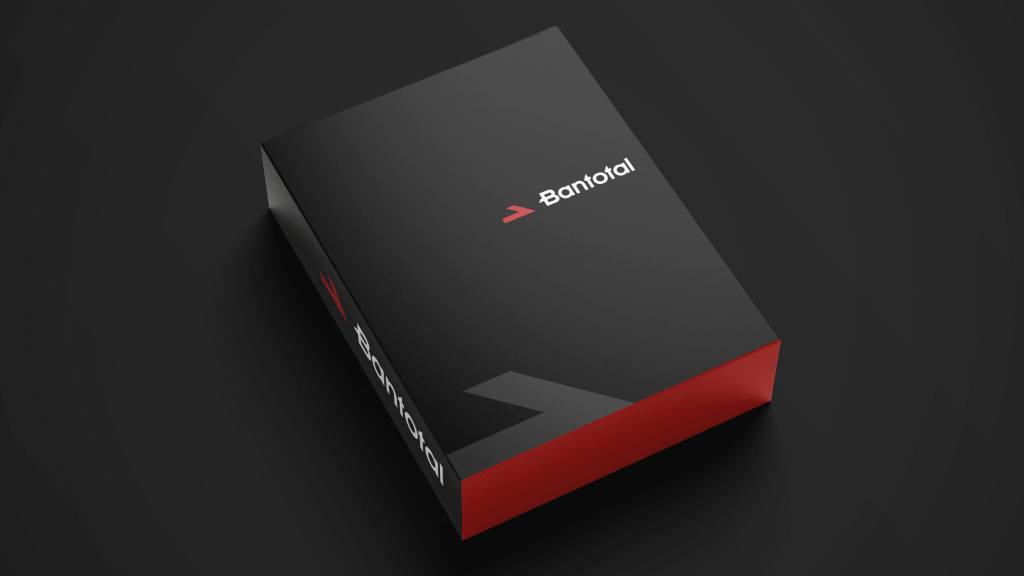
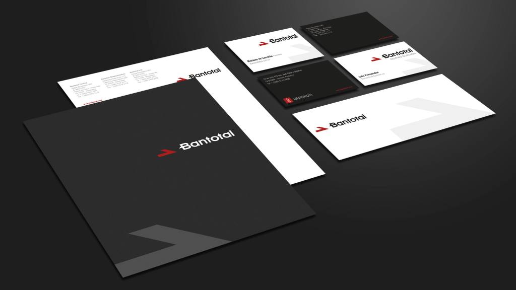
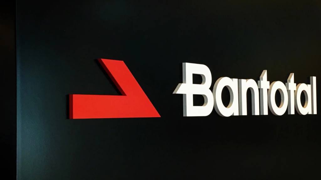
The strategy was based on synthesis and the construction of a more compelling symbol. The former four-arrow scheme was reduced to a single red arrow, uniquely and sharply defined, pointing from left to right to reinforce the idea of steady progress and clear direction. This gesture not only simplifies visual recognition but also concentrates the brand's conceptual energy into a single, unequivocal movement.
The logo was redesigned with a contemporary geometric typeface, custom-tailored for the brand to achieve a coherent formal dialogue with the isotype. A "V" is subtly suggested between both elements, associated with triumph and the concept of a generative womb, reinforcing the idea of a core, origin, and engine of development, in line with its claim “the core banking solution”.
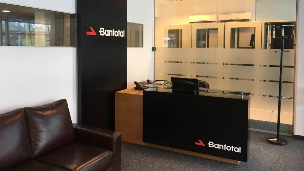
The corporate palette, dominated by red and black, solidifies a perception of strength, leadership, and determination, while complementary grays provide balance and professionalism in institutional applications. The typographic system and clear usage rules ensure consistency across all touchpoints, from stationery to digital environments.
The result is a more synthetic, modern, and strategic identity that positions Bantotal as a central, reliable, and progress-oriented technological solution, capable of projecting its leadership in the financial sector with clarity and impact.